S.A.F.E.
Enjoy the experience of finding a place called home.Project Overview
This is the second project for the Google UX Design Certificate course with Coursera. The objective of this course is to create a Responsive Web Design in Adobe XD.
My Role:
User Research, Conducting a Competitive Audit, Design, Prototyping, Wireframes, Usability Testing, and Iterating on Designs.
Tools:
Adobe XD
The Duration:
January 2022 to February 2022
The Product:
Siul Apartment Finding Experience is a website that helps people find apartments to rent or buy from any device. Target customers are people who work long hours and on the go. Siul Apartment Finding Experience goals are to make apartment browsing fun and easy.
The Problem:
S.A.F.E. target customers who struggle setting up walk through property tours because of their busy schedule.
The Goal:
Design a responsive website that allows users to quickly and efficiently find apartments that suit their needs and finances without stressing for a tour of an apartment.

Research
Research Summary
I organized interviews with target users, then used the insights to analyze the pain points users were experiencing. A primary user group, identified through research, were people who spend more time working than being able to schedule property tours.
This user group explained assumptions about apartment websites, but research also disclosed that time wasn’t the only factor for searching for an apartment. Other user problems included not having enough resources to help people get through the finding an apartment phase.
Here’s what I discovered:
- Customers aren’t having enough time to tour apartment complexes after work hours
- Apartment websites don’t provide an appealing search experience
- Resources aren’t available for first time apartment renters, owners and/or buyers
- Apartment website designs are often busy which results in difficulty navigating through the website
Persona
A persona was developed in the discovery period of the project. Designing for Jeff helped in making informed design decisions as I had the end user always in mind.

User Journey
I created a user journey map of Jeff’s experience searching for a new apartment to help analyze possible pain points and improvement opportunities.

Ideation
S.A.F.E. Sitemap
My goal for the sitemap was to apply filters to Jeff’s search to improve his overall website usability.

Paper Wireframes
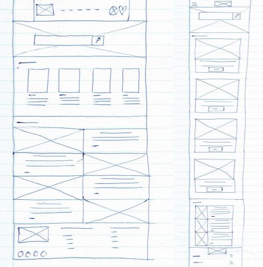
Then, I sketched out paper wireframes for each screen in my website, keeping the user pain points about time, navigation, and resources in mind.
The home screen paper wireframe variations, to the right, focus on enhancing the searching experience for users.

Paper Wireframe Screen Size Variation(s)
Considering S.A.F.E. customers access the site on a variety of different devices, I started working on designs for additional screen sizes to make sure the site would be fully responsive.

Digital Wireframes
Transitioning from paper to digital wireframes produced an easy way to understand how the page layout could help focus on user pain points and enhance the user experience.
Engaging on having resources available, a sizable search bar, useful button locations and visual element placements on the home page was a key part of my planning.

Digital Wireframe Screen SizeVariations


Lo-Fi Prototype
To design a low-fidelity prototype, I linked all of the screens involved in the primary user flow of searching for an apartment and submitting an application.
Siul Apartment Finding Experience Website:

Usability Study
- Moderated Usability Study
- United States, Remote
- 5 Participants
- Each Session lasted 10-15 minutes
Usability Study Results
I examined and arranged the data, using an affinity diagram, to create insights.
Based on the insights from the usability study, I made changes to improve the way users can access resources within the homepage. One of the changes is making the resource category available for all users on the homepage. I also deleted the secondary applicant section, to make the application form shorter.


Hi-Fi Prototype
My hi-fi prototype design changed after the usability study, as well as a few changes that I wanted to incorporate into the design.
Siul Apartment Finding Experience Website:

Design
Hi-Fi Designs


Hi-Fi Screen Variations
I incorporated additional screen sizes in my mockups based on my initial wireframes. Users shop from an array of devices. It’s important to improve the browsing experience for a range of devices such as mobile and tablet, so users can have a stable experience possible.


Accessibility Considerations
Making the designs accessible, I made sure that form validation must be implemented to inform users of missing/wrong information. I Also used headings with different sized text for clear visual hierarchy and made sure images and graphics are given an appropriate alternative text.
Key Learnings
What I Learned
This project was challenging for the fact I had to learn a new platform. But during the process of creating the website, I started to grasp the basics of using Adobe XD. I have to work on having the correct grid layout for the different devices I’m designing for. Every day is a learning experience. Can’t wait to learn more!
What’s Next
I would like to organize a follow-up usability testing on the new website and update the website for better user experience.