Siul Exclusives
A shoe app that focuses on quick and efficient transactions.Project Overview
This first project was for the Google UX Design Certificate course with Coursera. The objective of the course was to learn about the foundations of user experience and to gain UX skills.
My Role:
Wireframes, User Research, Design, Prototyping, Usability Testing, Conducted a Competitive Audit, Accounting for Accessibility, and Iterating on Designs.
Tools:
Figma
The Duration:
December 2021 to January 2022
The Product:
Siul Llah Exclusives is a shoe store located in the suburbs of a metropolitan area. Siul Llah Exclusives aims to give customers quick and efficient transactions to reserving the latest shoes. Target customers are shoe enthusiasts who love high quality footwear.
The Problem:
The target customers of Siul Exclusives are always looking for the latest style of shoes. However, it’s taking too long for customers to order and/or reserve shoes on the release date.
The Goal:
Construct an app for Siul Llah Exclusives that give users a rapid and effective purchase when reserving and/or buying shoes.
Research
Interview
I conducted interviews and created empathy maps to understand the users and their needs I’m designing for. A primary user group identified through research were shoe enthusiasts who spend more time than needed reserving pre-ordered shoes.
This user group explained assumptions about shoe apps, but research also disclosed that time wasn’t the only factor for users reserving shoes. Other user problems included difficulty navigating through the app and notifications about shoe size availability.
Online Survey
I’m designing a new app to help people quickly reserve exclusive shoes. Before the debut of the app, I need to evaluate if searching and reserving shoes is simple for users to do. I would like to recognize what specific difficulties our users might encounter in the searching, payment, and connection process, and how I can help fix those problems.
12 Questions | 13 Responses
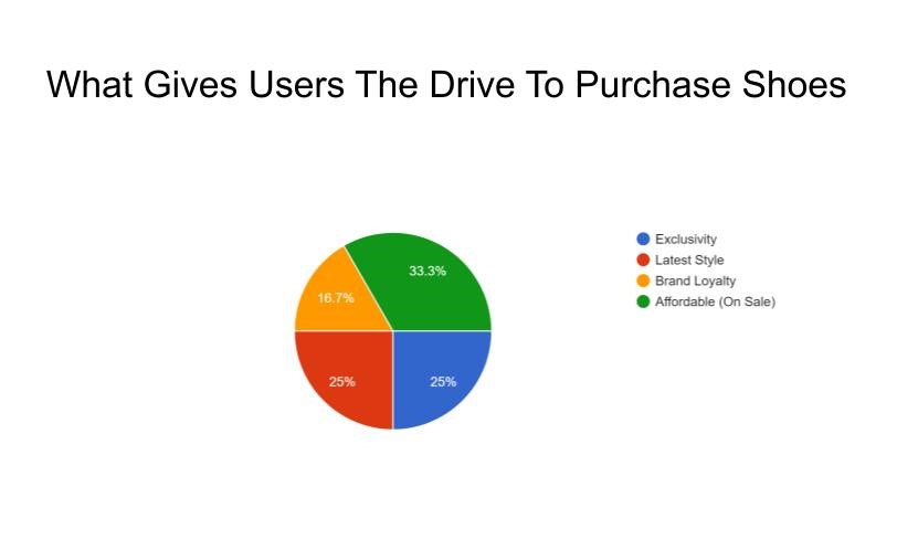
Survey Results
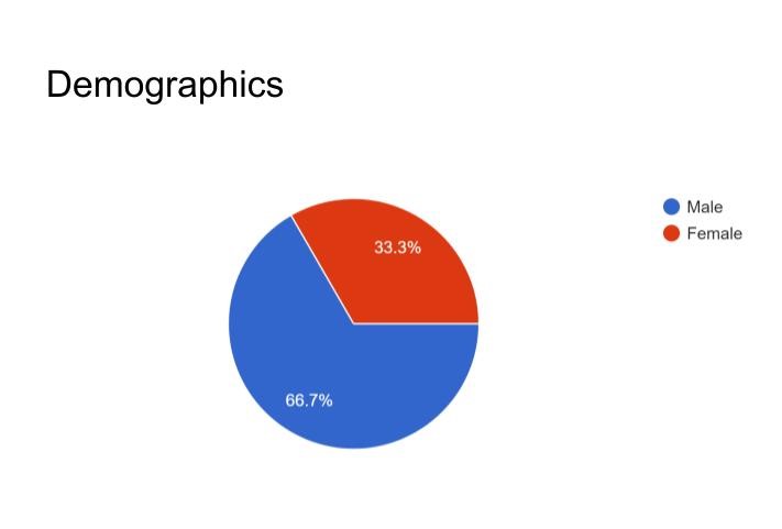
- Majority of my audience were male
- 30 – 49 years old
- StockX, SNKR, and GOAT were the most commonly used tools to reserve and/or purchase shoes.
- 50% have 15+ pair of shoes
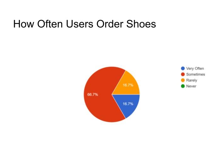
- 67% order shoes occasionally
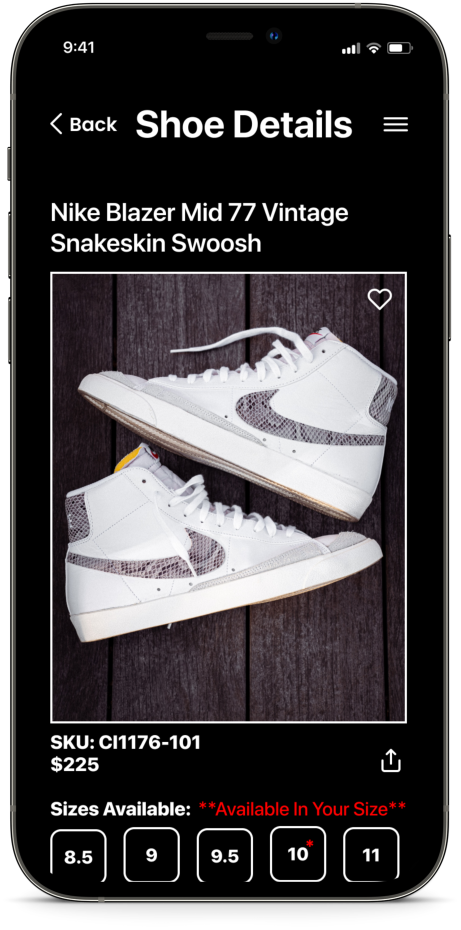
- Once they’re on a app, the majority of users have a problem knowing is their size is avaible before checkout.
- To help with reserving and/or purchasing shoes, their idea app should have: easy navigation, notification on shoe size availability, and a fast and efficient transaction.
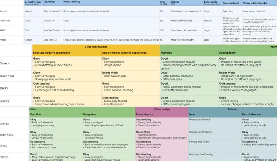
Competitive Audit
After gathering data from the survey and interviews, I conducted competitive and market research to identify current design conventions and prioritize product features.
I also performed usability testing to determine what concepts work in terms of design patterns and user flows.
Persona
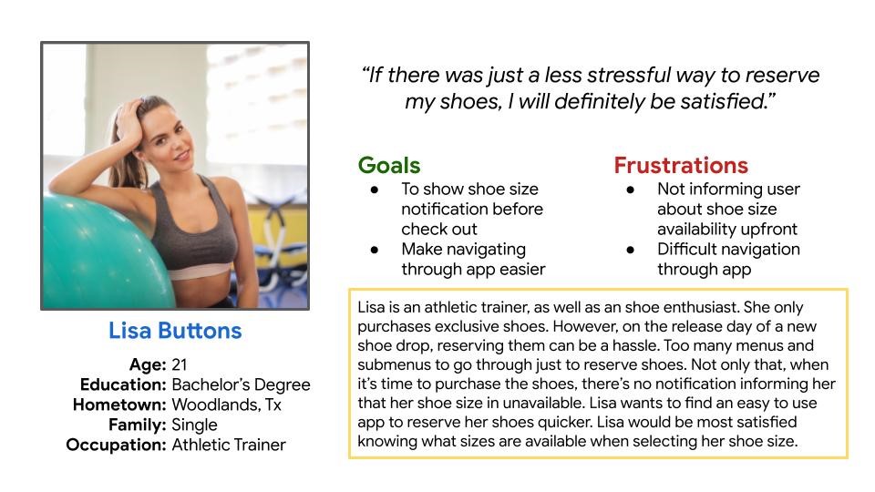
Based on the research found in the discovery period of the project, a persona was developed, Lisa Buttons. Designing for Lisa helped in making informed design decisions as I had the end user always in mind.
Ideation
Storyboarding
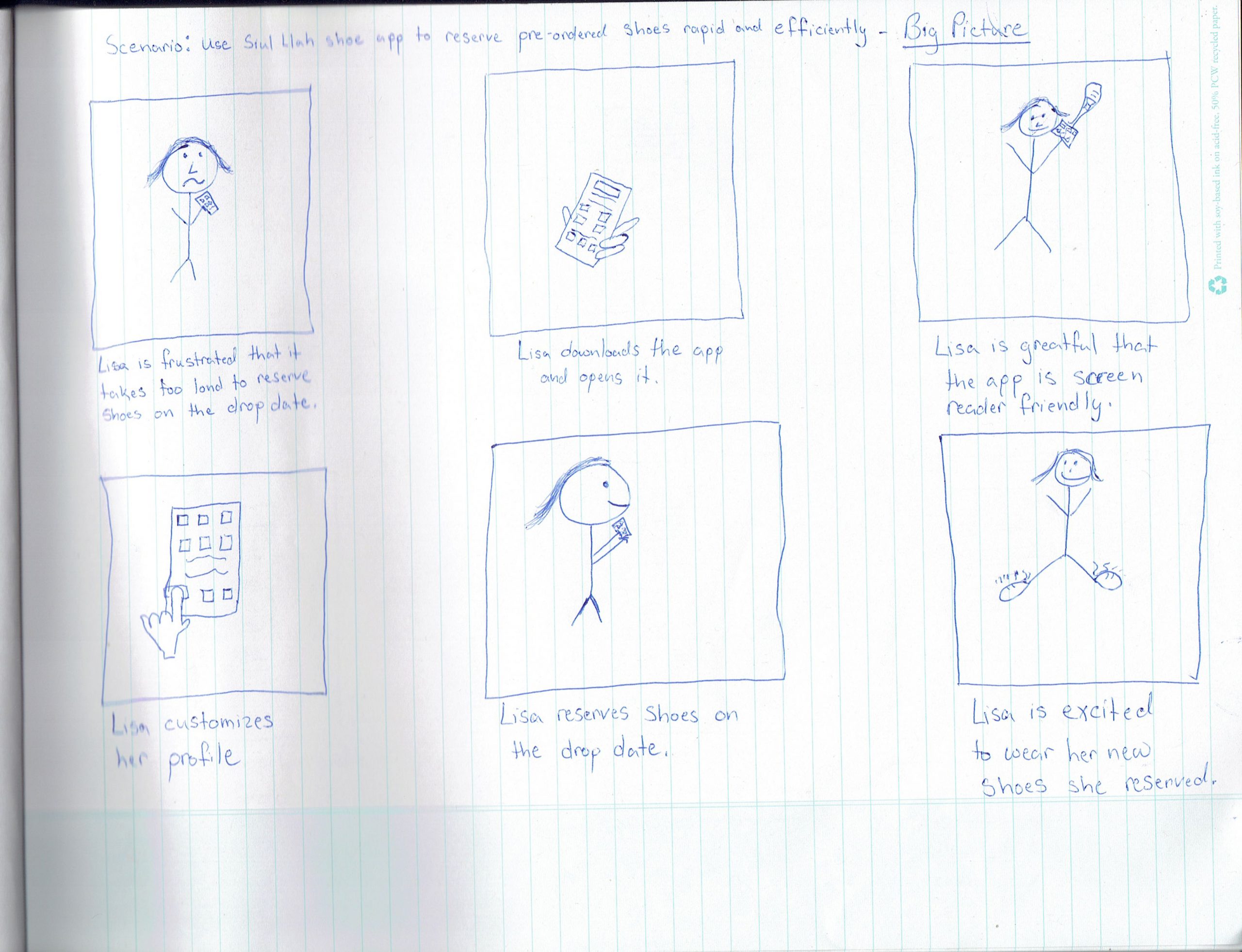
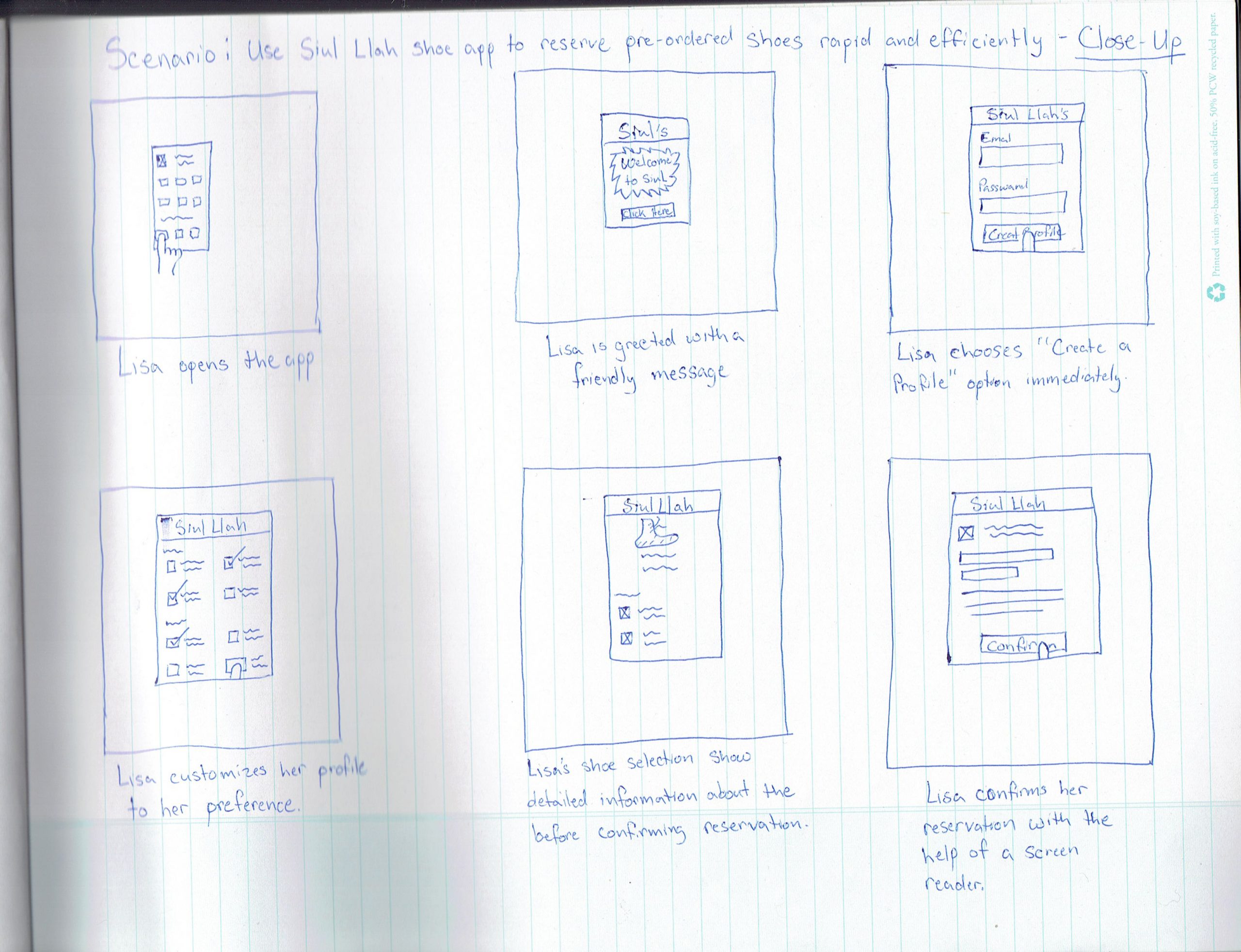
Keeping Lisa in mind, I story boarded the user’s behavioral flow from content discovery to topical playlist creation with Siul Exclusive integrated in her behavioral decision making. These flows helped in defining the necessary features required for Lisa to successfully navigate through the app.
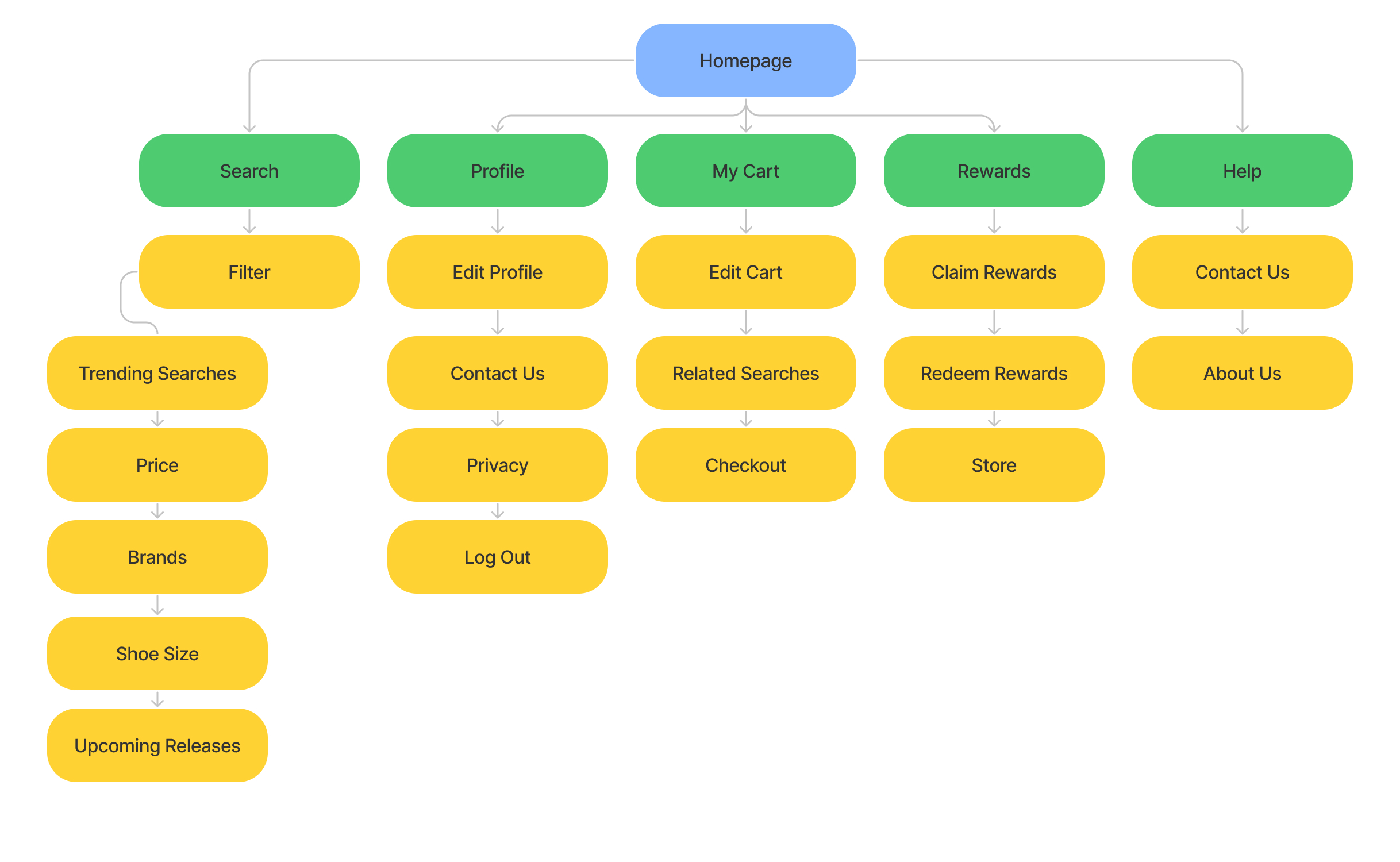
Siul Exclusives Sitemap
By narrowing the features necessary for the Siul Exclusive application to function effeciently, I created a sitemap to organize the pages, information, and navigation of the app.
Paper Wireframes
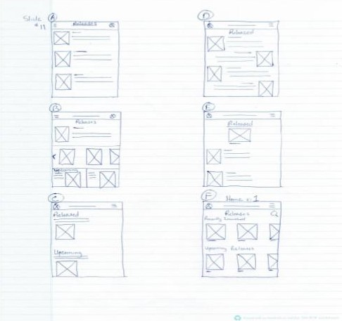
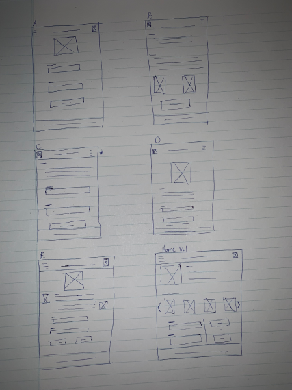
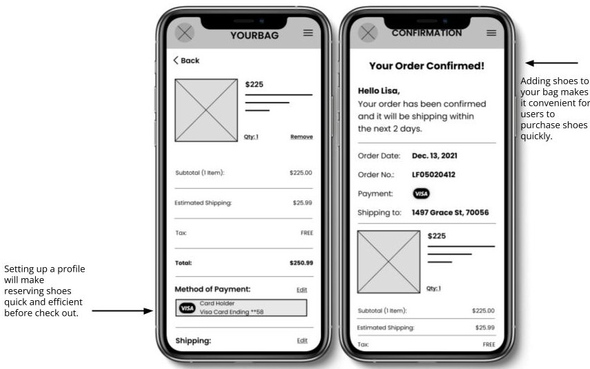
Using time to design different variations of each screen of the app on paper guaranteed that the elements that made it to digital wireframes would fit just right to address user pain points. For the home screen, I prioritized a quick and easy reservation process to help users save time.
Digital Wireframes
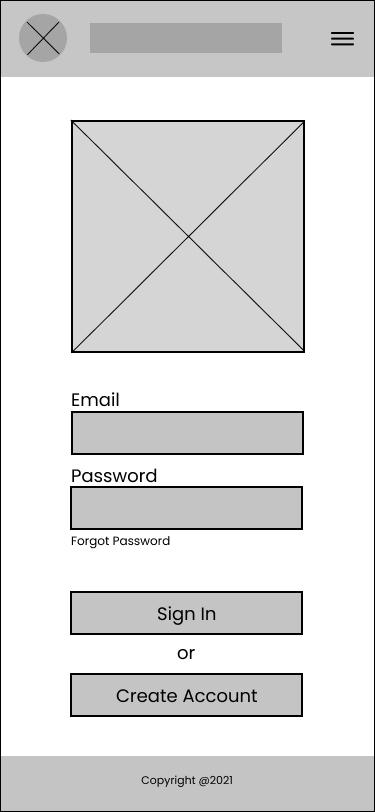
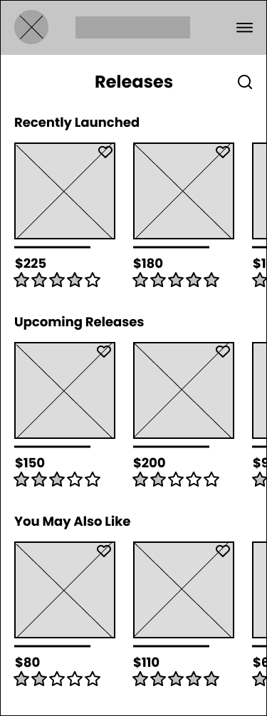
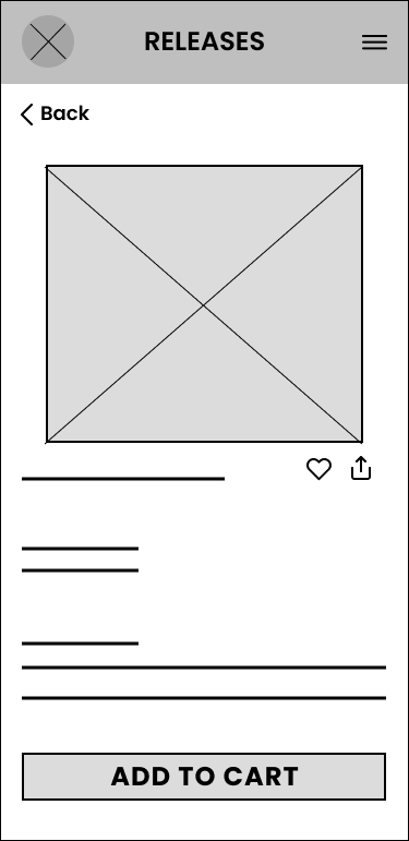

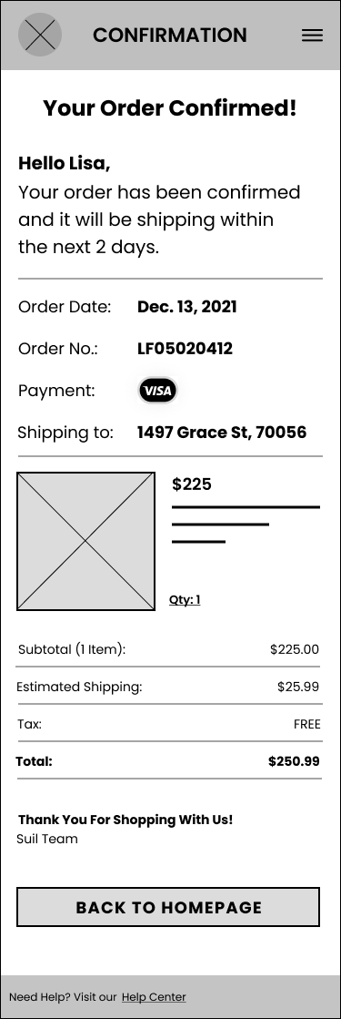


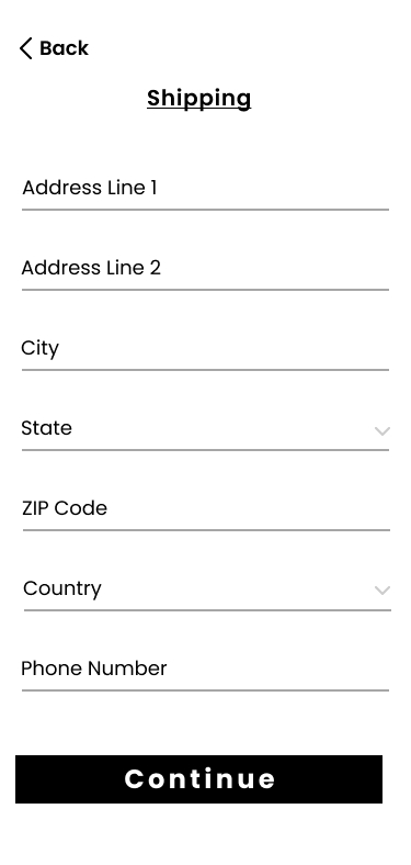
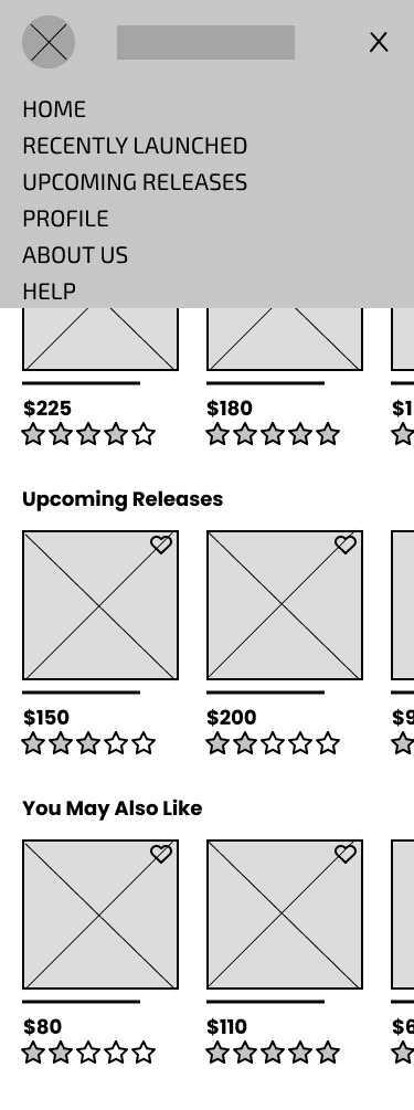
As the initial design phase continued, I made sure to base screen designs on feedback and findings from the user research.
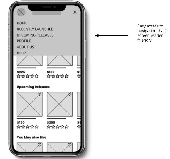
Easy navigation was a key user need to address in the designs.
Lo-Fi Prototype
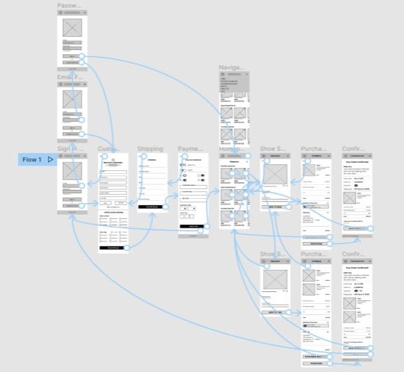
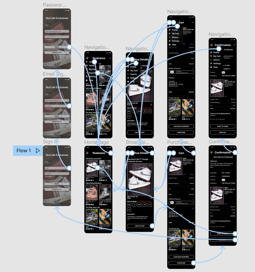
The low-fidelity prototype linked the primary user flow of reserving and purchasing shoes quickly, so the prototype could be used in a usability study with users.
View the Siul Llah Exclusive App Lo-Fi Prototype.
Hi-Fi Prototype
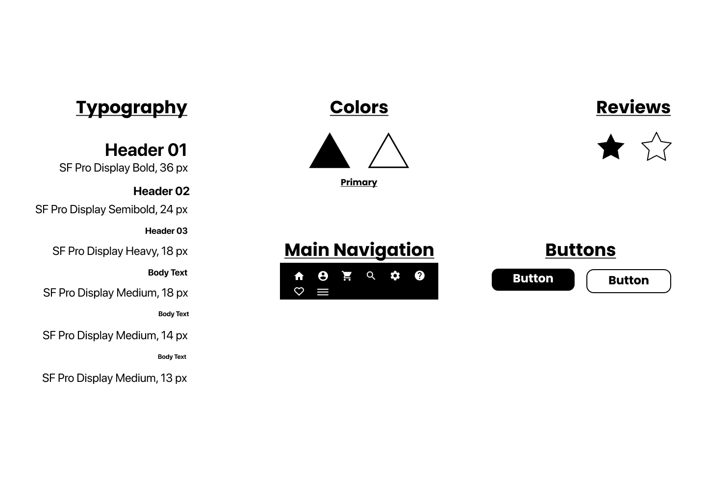
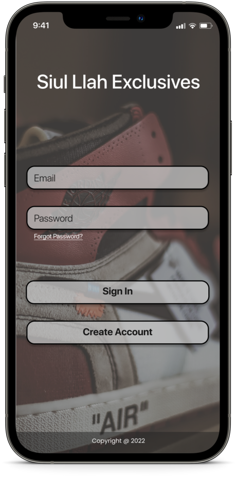
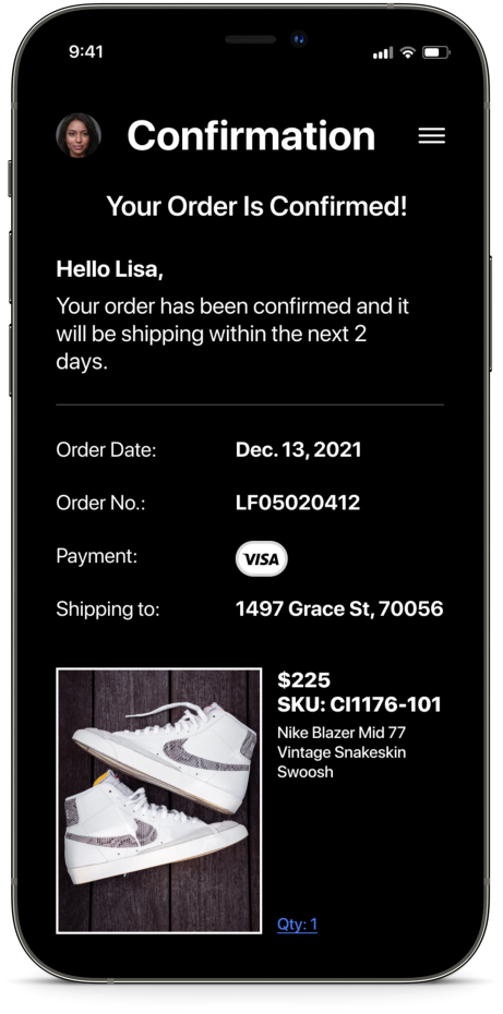
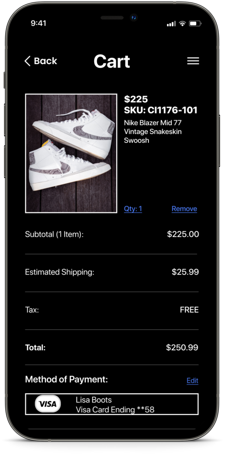
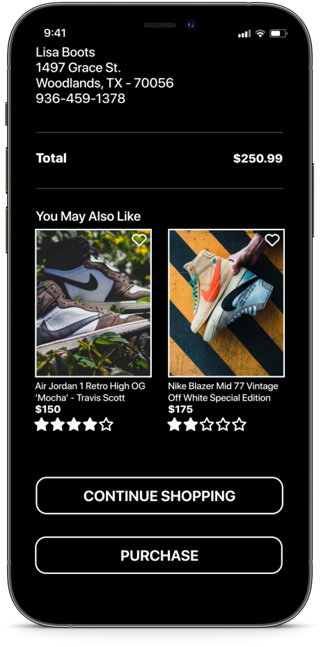
The final high-fidelity prototype presented cleaner user flows for purchasing exclusive shoes. Met the user needs with larger font and by having more options to shoes before checkout.
View the Siul Llah Exclusive App Hi-Fi Prototype.
Design
User Testing
Iterating on Designs
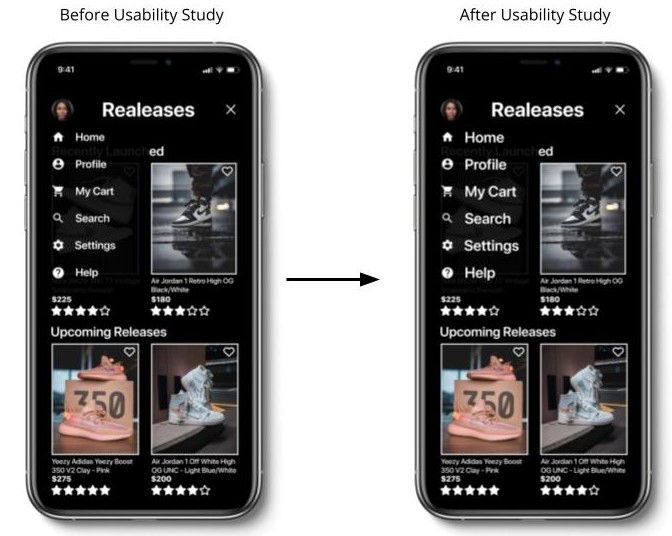
Early designs allowed for some customization, but after the usability studies, I changed the font of the side menu larger to make it more visible for users to navigate throughout the app easier.
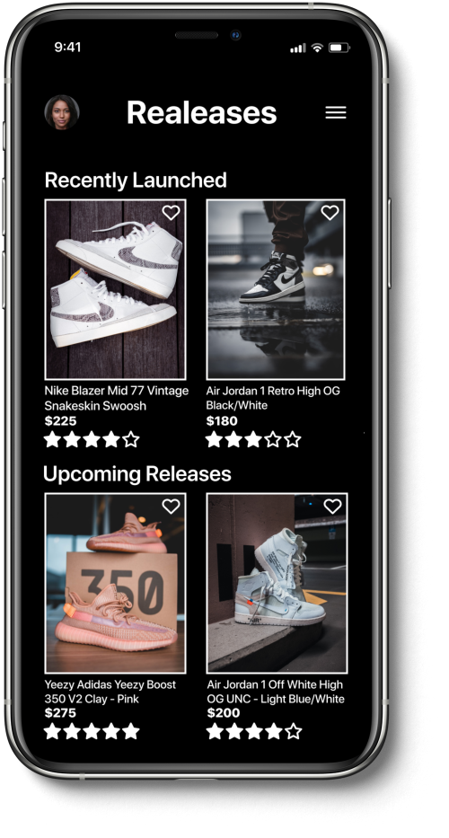
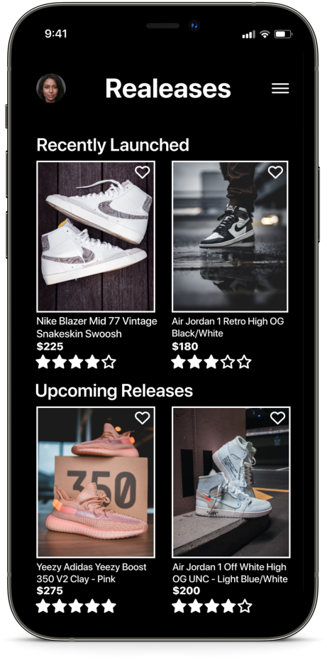
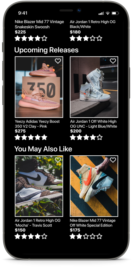
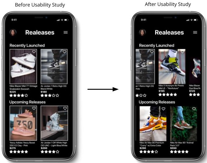
The second usability study disclosed the need of having more shoe options. I gathered selected photos and framed them within the proper spacing. I then made “Recently Launched,” “Upcoming Releases,” and “You May Also Like” subheaders able to scroll horizontal with a few shoes to be seen.
Project Learnings
While designing the Siul Llah Exclusives app, I learned during the initial process you can start overthinking and can be overwhelming at times. But usability studies and peer feedback can smooth out the process on specific goals that need to be accomplished before the delivery process.
A huge impact from this project was the experience users felt while using the Siul Exclusives App which brought excitement and simplicity.
Next Steps
The primary focus for this phase of the project was learning the foundation of UX/UI Design. It’s important to get the basics down first before adding extra features. My next steps will be to:
- Organize more research to resolve any problems that are found
- Verify if the issues users experienced have been adequately addressed
- Update the app for better user experience
