SIUL Fitness
Designing in a way to get people to a healthier lifestyle.Project Overview
The third and final project for the Google UX Design Certificate with Coursera focuses on designing for social good.
My Role:
User Design, User Research, Paper and Degital Wireframes, Conducted Interviews, Usability Testing, Accounting for Accessibilty, Conducted a Competitive Audit, Iterating on Designs, Determinging Information Architecture, and Responsive Design
Tools:
Figma
The Duration:
February 2022 to March 2022
The Product:
Siul Fitness unlocks the resources you need to stay or to get fit. It’s a tool that helps people learn about staying healthy no matter where they are. Siul Fitness targets millennials who are taking their health serious, as well as anyone at any age who’s wanting to start a fitness journey to a healthy lifestyle.
The Problem:
45% of people would exercise more if they could workout at home. While 28% of people want cheaper alternatives to the gym, classes with friends or colleagues, and a personal trainer to be accountable at 27%. At Siul Fitness, we have general knowledge about the lack of fitness within the nation and limited understanding on what drives people to not exercise.
The Goal:
Create an app that will help people become healthier and continue to stick with their fitness goals no matter where they are.
Personas
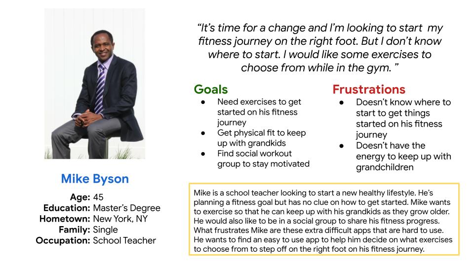
Mike Byson is a school teacher who needs an easy to use fitness app to help him get back into physical shape because he wants to be able to play with his grandkids as they grow older.
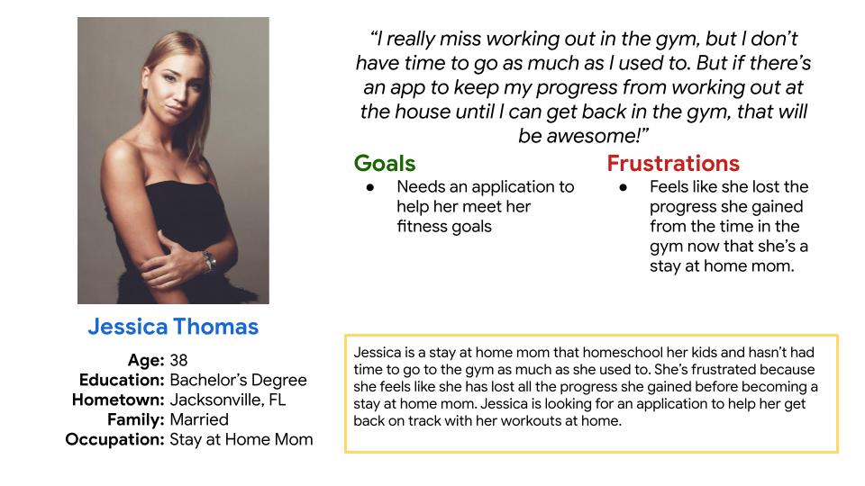
Jessica Thomas is a stay at home mom who needs an easy fitness app/website to get back into physical fitness shape because she feels like she lost her physical ability from when she was working out on the daily basis.
Research
Interview
I used collected data on why most Americans don’t exercise to develop interview questions, which were then used to conduct user interviews. Most interview participants reported that they were unaware of how many Americans didn’t exercise. The feedback received through research made it clear that some users would be open to staying active and to get some type of exercise movement at least 3 days through the week if they had an easy to use tool to help and guide them.
Competitive Audit
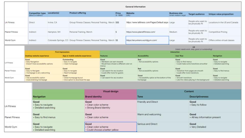
An audit of a few competitor’s products provided direction on gaps and opportunities to address with the Siul Fitness app.
Click to view the full Competitive Audit
Ideation
CrazyEight Exercise
I did a brief CrazyEight ideation exercise to come up with ideas for how to address gaps identified in the competitive audit. My focus was specifically on getting people to exercise and to stay healthy.
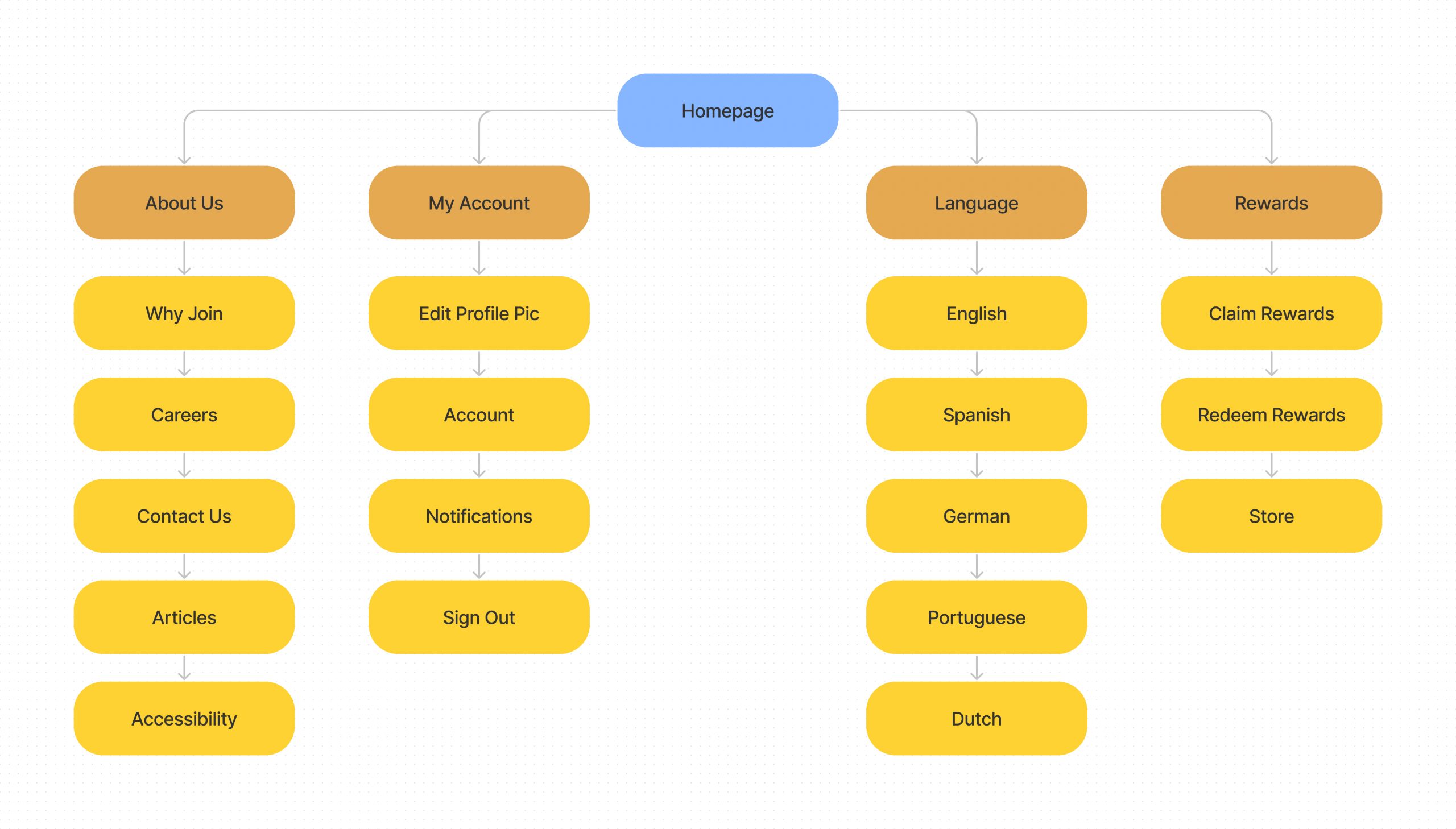
Siul Fitness Sitemap
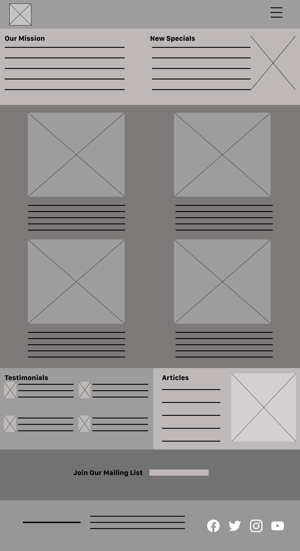
With the app design completed, I started work on designing the responsive website. I created a sitemap to guide the organizational structure of each screens design to ensure a cohesive and consistent experience across devices.
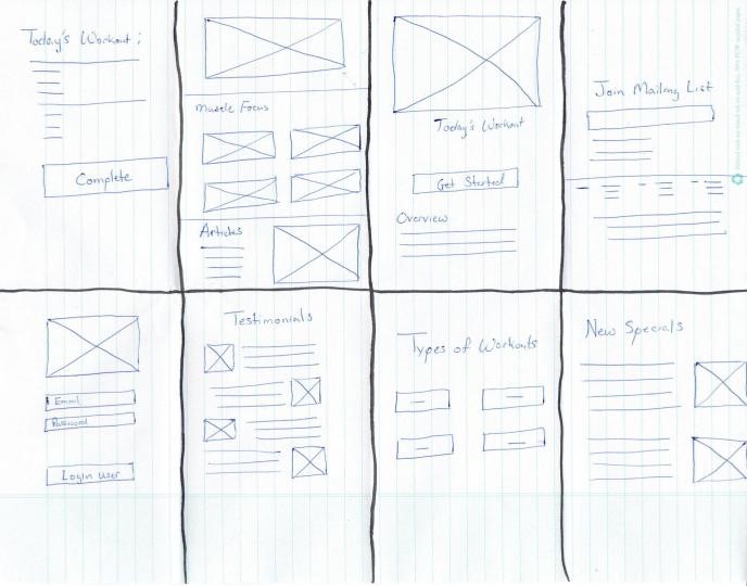
Paper Wireframes
Using time to design different variations of each screen of the app and website on paper guaranteed that the elements that made it to digital wireframes would fit just right to address user pain points.
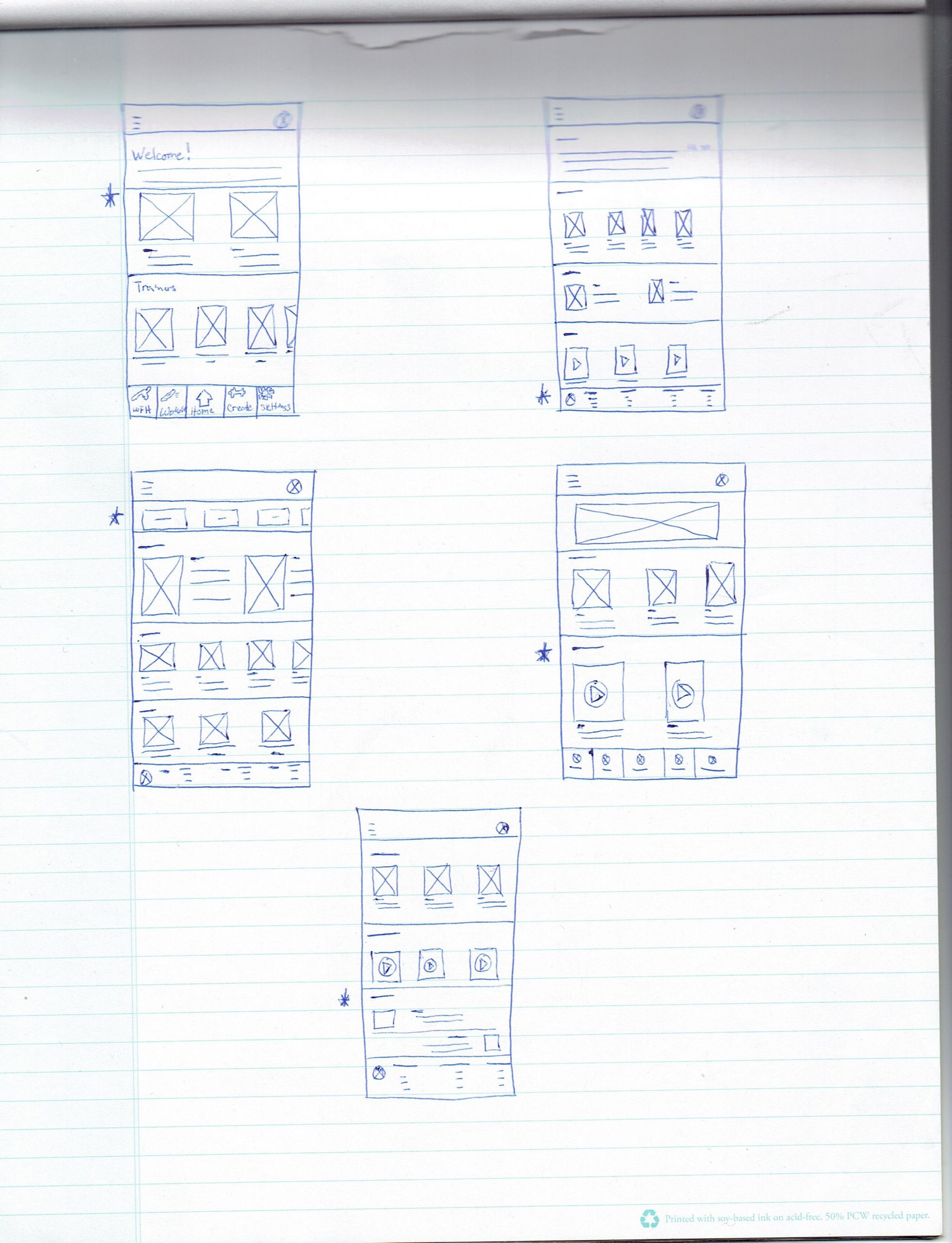
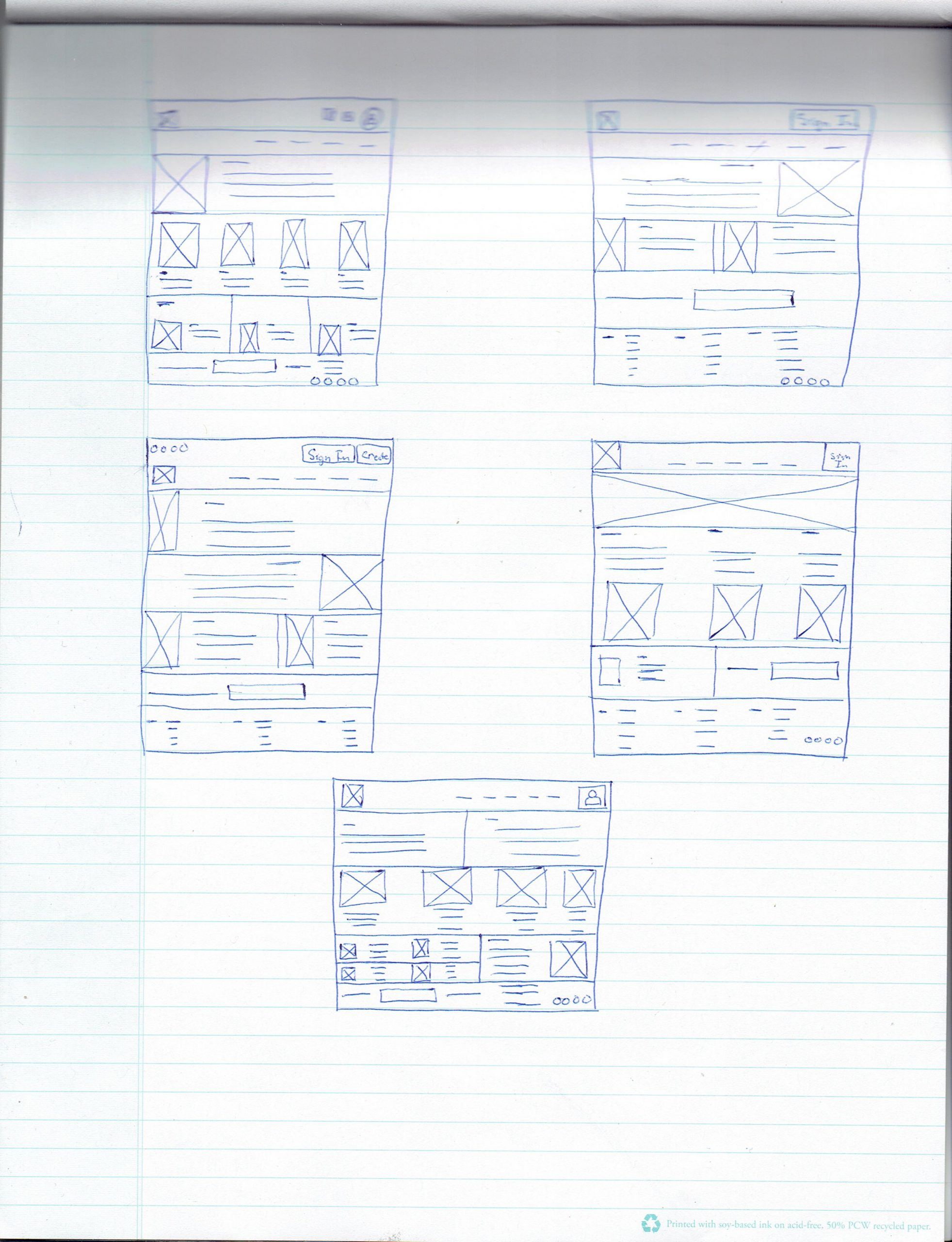
Digital Wireframes
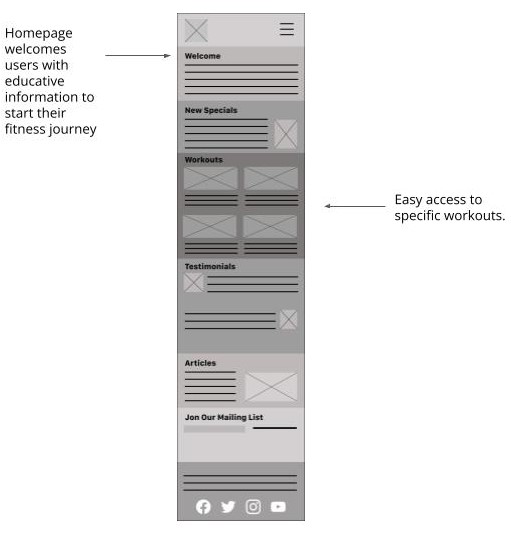
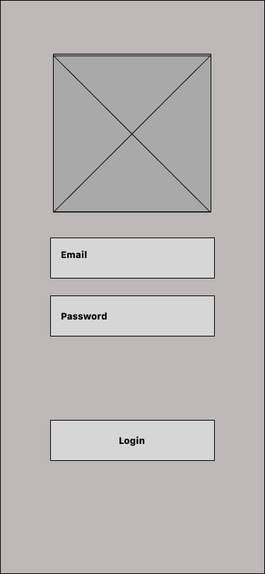
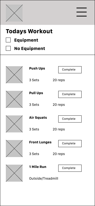
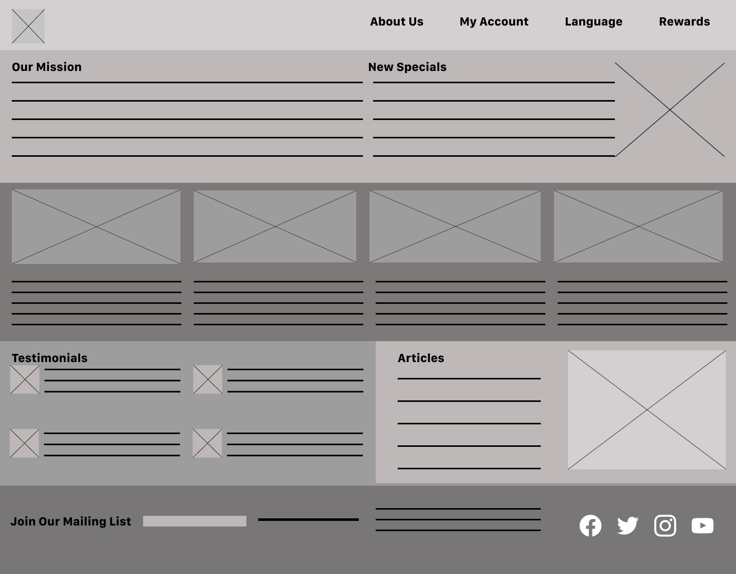
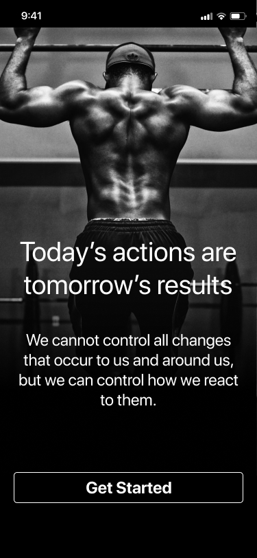
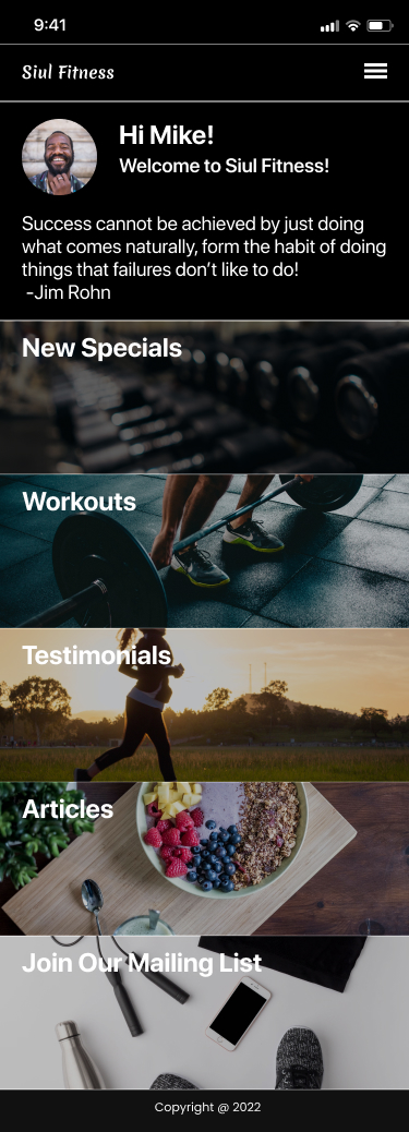
After ideating and drafting some paper wireframes, I created the initial designs for the Siul Fitness app. These designs focused on welcoming the user and to to give them motivation to reach their fitness goals.


Screen Size Variations
Lo-Fi Prototype
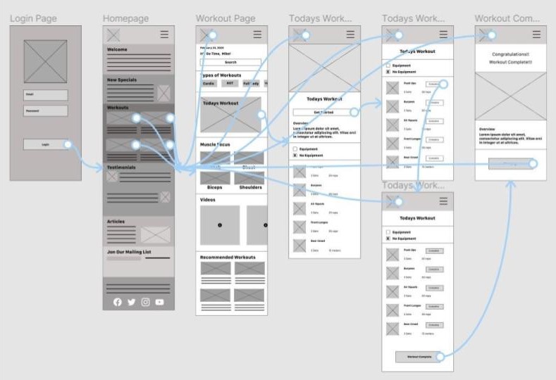
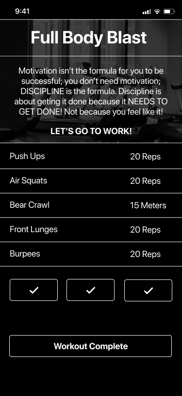
To prepare for usability testing, I created a low-fidelity prototype that connected the user flow of selecting a workout and completing it.
View the Siul Fitness Lo-Fi Prototype
Usability Study
- Moderated Usability Study
- United States, Remote
- 5 Participants
- Each Session lasted 10-15 minutes
Usability Study Results
I examined and arranged the data, using an affinity diagram, to create insights.
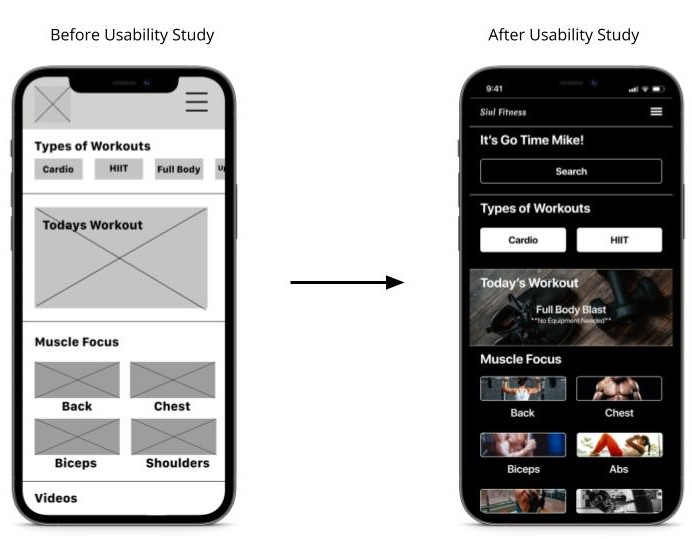
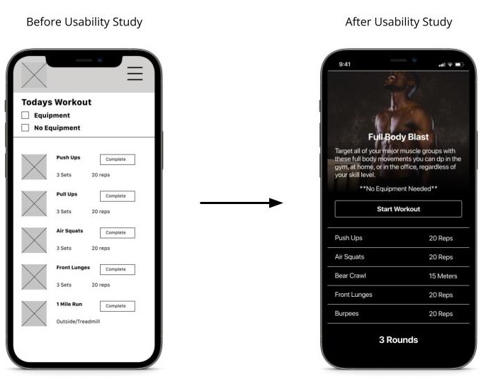
Based on the insights from the usability study, I changed the layout so users could search for specific workouts. This included adding a search bar. I also designed a section of workouts from other users, as well as trending workouts. Users also wanted to know what the workout consist of before starting it, so I added that frame to the design.
Based on the insights from the usability study, I applied a search bar for users to search for specific workouts within the app.
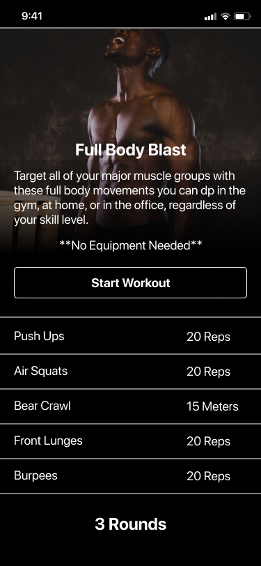
Additional design changes include adding an overview of the selected workout for the users. Providing a clear detailed summary of the workout.
Design

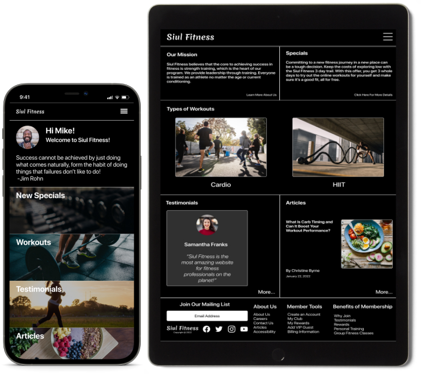
Responsive Designs
Mobile Website, Tablet, and Desktop

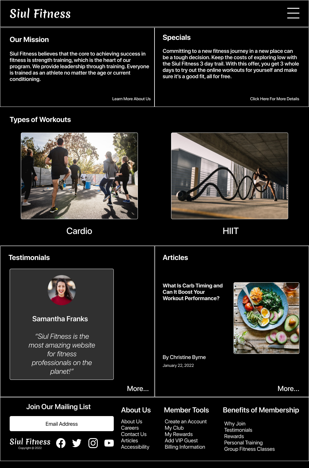
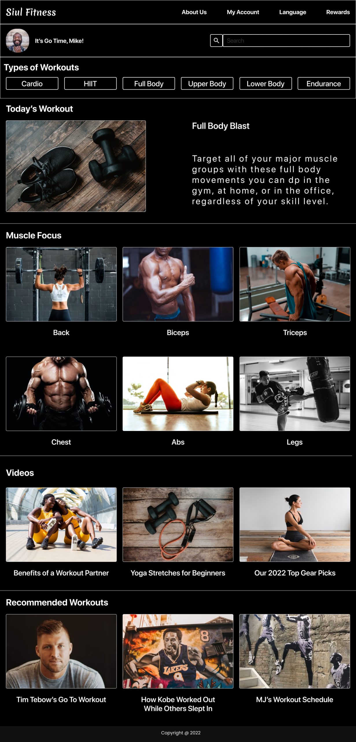
Mockups
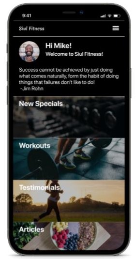
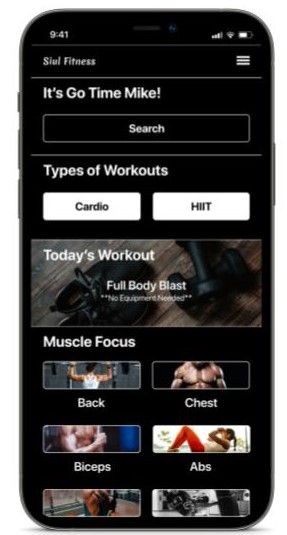
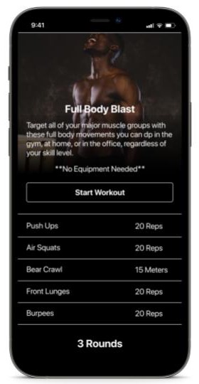
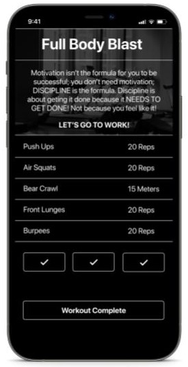
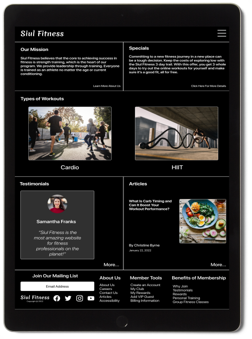
Hi-Fi Prototype
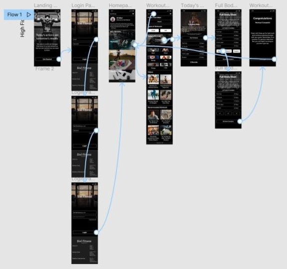
The high-fidelity prototype followed the same user flow as the low-fidelity prototype, including design changes made after the usability study.
View the Siul Fitness Hi-Fi Prototype
Key Learnings
What I Learned
I learned when designing for user needs, it can be very challenging. But taking your time throughout each step of the design process and aligning it with specific users needs can help create solutions that were both feasible and useful.
What’s Next
Moving forward, I would like to add more educational resources for users to learn more about being healthy. Then, I would like to conduct more research on how successful the app is when users are reaching their goal to stay healthy. Finally, I would like to provide incentives and rewards to users for actually working out.